A city’s iconography needn’t always be as grandiose as a building or a statue. It can also take the shape of something so simple and transparent that most will walk by it on a day-to-day basis without taking particular notice—and yet will still always expect it to be there. Take the black-and-white street signs that have long served the intersections of Toronto. Though slightly bastardized over the years, they have remained largely unchanged since their introduction in 1947—so much so that the new street signs currently being introduced by the city (so large and flat, their typography seeming almost like an afterthought) are jarring by comparison. Looking at them, one can’t help but feel a small part of the city’s charm and uniqueness is lost with each sign replaced.
David Vereschagin feels the same way about another of Toronto’s signposts. A typographer as well as a book and magazine designer, Vereschagin was quickly taken with the distinctive lettering gracing the walls and signage of the city’s subway system when he arrived in Toronto from Edmonton, in 1983. “I knew it wasn’t an existing typeface that I knew of,” he says. “When people wanted that look, they usually went with Futura. It struck me as being unique.”
In use since the opening of the subway’s original twelve stations, in 1954, the unnamed typeface eventually began to fall out of use as new stations were built and old stations were refurbished in the nineteen-seventies and -eighties, a variety of different typefaces taking its place. “No doubt this was cheaper and easier and considered ‘close enough,’” Vereschagin says. “The squashed Helvetica Bold in the Queen station is particularly atrocious.”
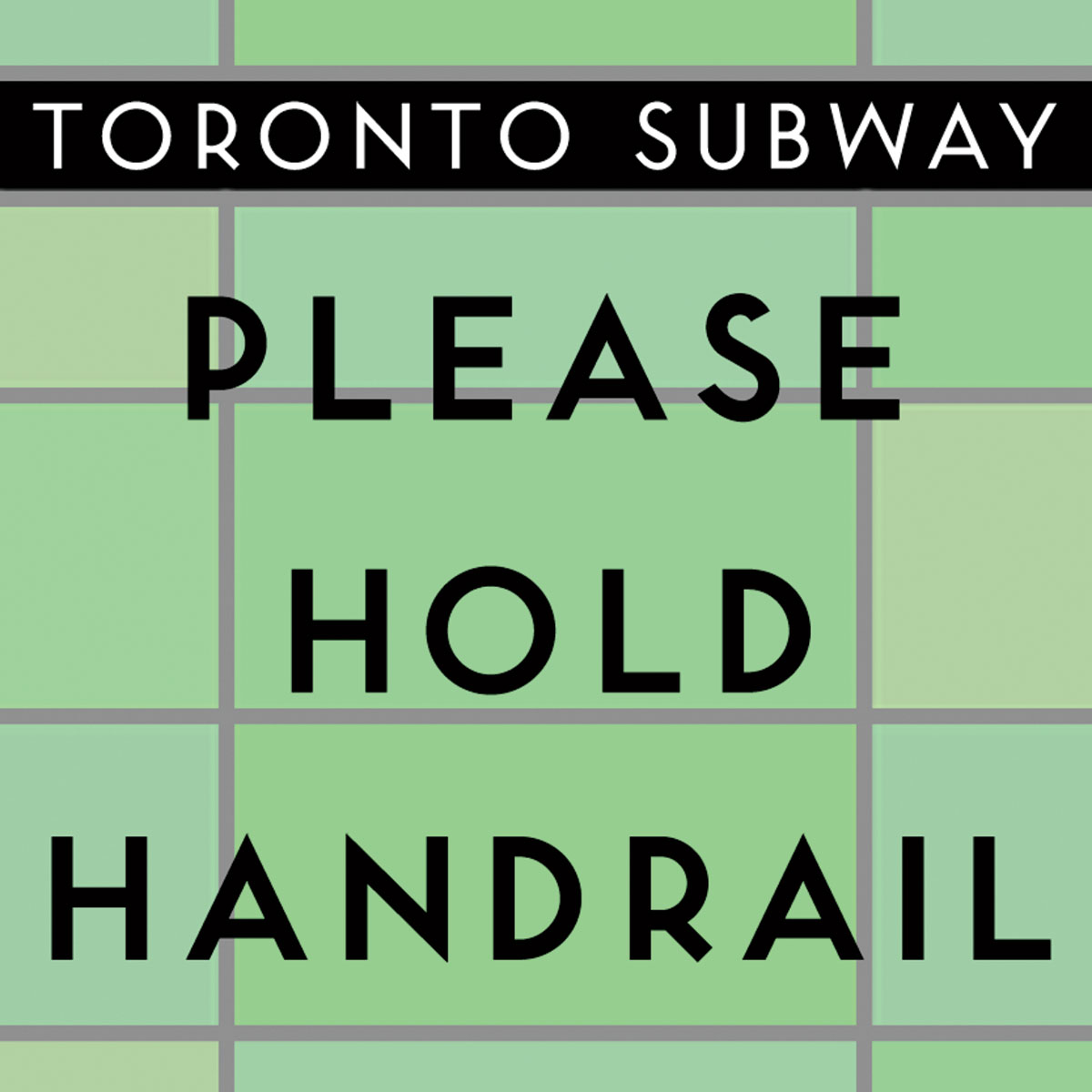
In 1992, Vereschagin began planning a way to preserve this part of Toronto’s design culture, though it would be another seven years before he would begin in earnest. “In 1999…I finally got around to making a systematic visit of all the Toronto subway stations that had examples of the old lettering still in use,” he says. “Where I could physically reach the lettering I took sample rubbings by laying a piece of tracing paper over the lettering and lightly rubbing a soft pencil over the outlines. Where I couldn’t reach the lettering, I took photographs.” This past spring, Vereschagin finally released the aptly named Toronto Subway font.
As the original typeface had only upper-case characters and a few punctuation marks, Vereschagin added numerous symbols—the question mark, the exclamation mark, the euro sign, etc.—and also took the liberty of designing lower-case characters based on the principles he gleaned from the original lettering.
Though he has found examples of the typeface—handwritten—on the subway’s original engineering drawings, dating back to 1948, Vereschagin has not yet been able to determine who designed the original lettering. “The naive aspects of the subway lettering hinted to me right away that it was probably not the work of an actual type designer,” he says. “It seems, instead, that it may have originated with the T.T.C. engineering department….Whether this was one person’s lettering style or the style used by T.T.C. engineering illustrators generally, I don’t yet know.”
The Toronto Transit Commission revived the use of its unnamed typeface on the walls of its new Sheppard subway line in 2002, a practice Vereschagin hopes will continue, despite the fact he has still not told the commission of his creation.
Toronto’s street signs should be so lucky.