Toronto’s transit commissioners are restless to renovate the subway system—not to make it run better, but to spruce up the stations. For justification they can conveniently point to their own neglect: makeshift alterations and repairs are everywhere, signage is a mess, and it seems like eons since the tunnel-washing train has passed through.
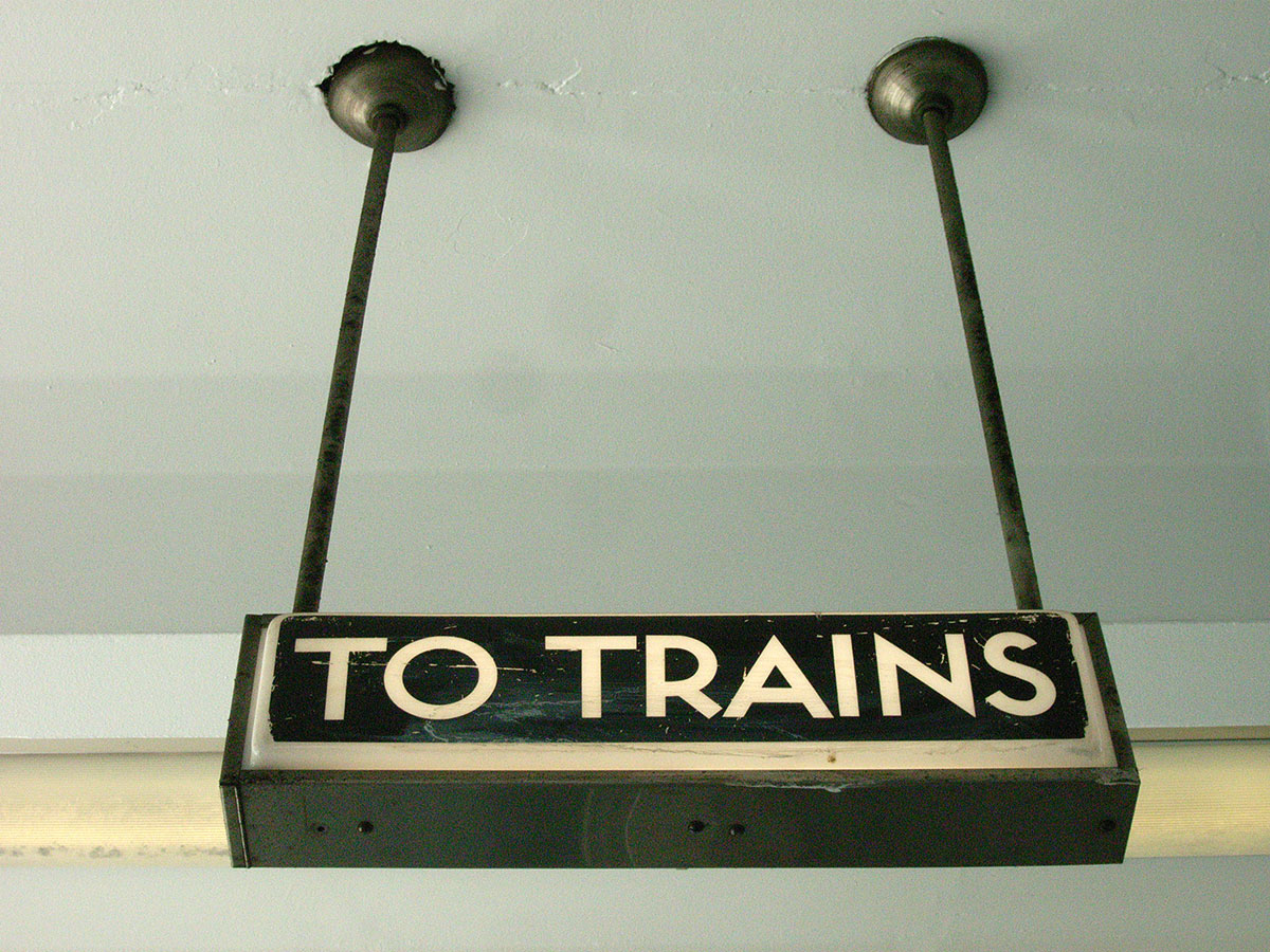
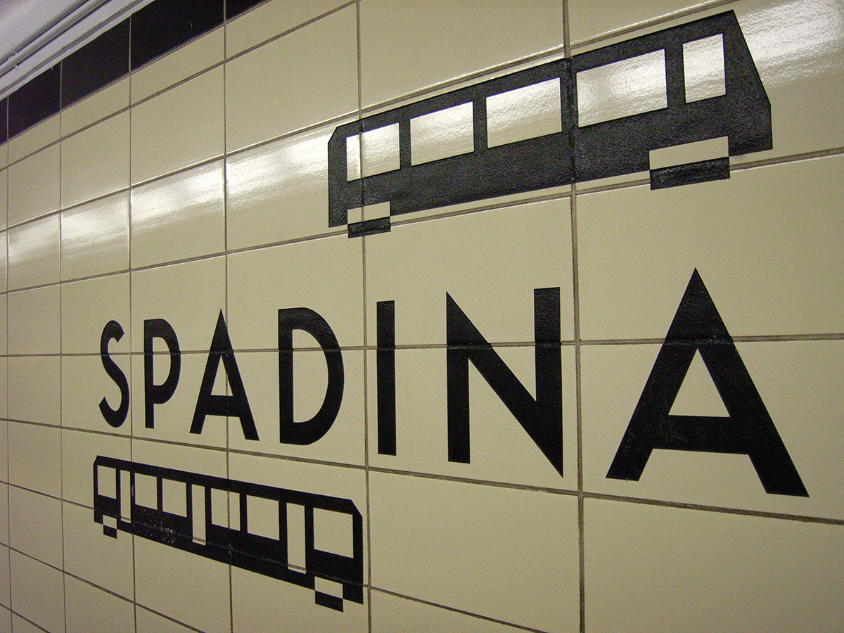
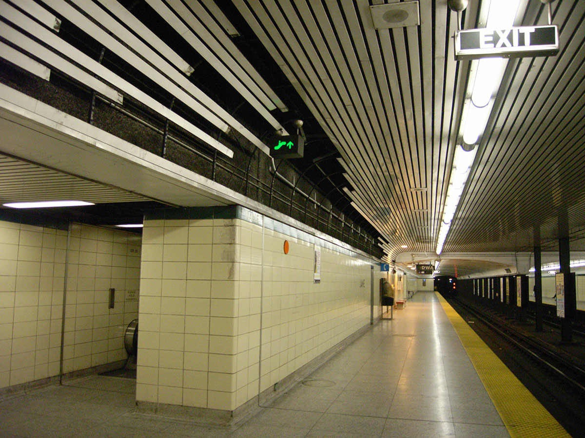
When things get old and dirty, it’s hard to see their integrity; yet for its age, integrity is the one thing much of Toronto’s subway still has in spades. Take the Bloor–Danforth line, which survives much as it was built, in the nineteen-sixties. Beneath the dirt, a powerful, minimalist modernity still shines. From end to end, original tiles, typeface, signs, lighting, railings, terrazzo, and other details are slightly worse for wear, but look better than the renovations and alterations made since.
I remember the redo of the original Yonge line, in the nineteen-eighties. Pallets of thick, heavy tiles were plunked down on subway platforms while crews got to work with crowbars, glue, and grout. After a few weeks of chipping, the new tile took the place of the original Vitrolite glass. Eglinton became the only station where the original 1954 design was retained, with the help of materials salvaged from closed areas of the station, and from the ravaged Queen station to the south.
The years have not been kind to the renovated portions of the Yonge line. I have not heard much praise for the pukey pea-soup coloured tile on the walls of Dundas station, the brown mottled tile adorning College and King, or the unfortunate choice of lettering that marks Queen. High-profile Union is a mess: the original (and rugged) terrazzo floors were replaced with tile that has cracked and chipped, and is now lousy with patches, and a troublesome metal cladding system that covered the walls has had to be removed.
On the face of it, the recent makeover of Museum station, in fancy Egyptian-and-sundry mode, suggests an attempt to do better. The original artist drawings show the excitement of the Royal Ontario Museum brought underground. But unlike those renderings, the final product is marred by prominent, ugly intrusions, including overhead conduits, the ugly sodium lighting of the Designated Waiting Area, and portions of the old tile simply covered over with paint (already chipping). And while even the eighties redesign of the Yonge line covered entire stations, Museum’s new decor doesn’t extend beyond its platform—the stairs and upper level still fitted with the original yellow tiles.
So there is an ominous sense of déjà vu as transit commissioners attempt to assuage public discontent over the dirt with promises of fancy new stations.
But multi-million dollar stage-set redesigns aren’t the only options. What about restoration, instead? The term describes putting something back into its original condition, which in the case of subways has its advantages. The design work is already done; the decision validates the original as iconic, and the system’s integrity as understood. As the urban planner George Kapelos wrote in the Globe and Mail a generation ago, when the unfortunate retiling on Yonge began, “Someone should point out to the TTC that when the line was first built, it was designed. That means that thought was given to uniformity of station design, to materials and graphics. What is happening now doesn’t respect that at all.”
We don’t dare build infrastructure so ambitiously today, so why not preserve the achievement?


A Better (Sub)way?
Read by Paul Vermeersch